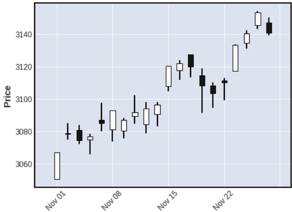
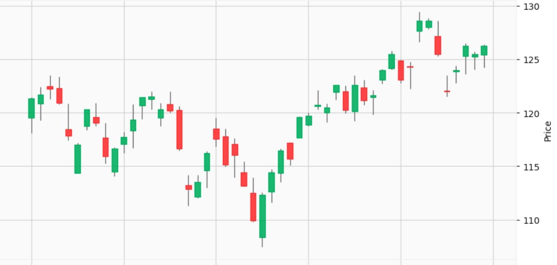
I was on my quest to find ways to make a trading bot and in the journey I found some cool stuff that I would like to share. And one more thing I want to add is that there are not many tutorial-based resources available to make this happen there were indeed docs and blogs like these so thanks to this repository that helped me a lot
https://github.com/matplotlib/mplfinance
So let's get started with the code.
Step 1
You'll need to download these packages: yfinance, pandas, matplotlib, and finance.
You can install these like this pip install yfinance pandas matplotlib mplfinance
Yfinance for the economic data required for the candlestick chart.
Pandas allow us to analyze big data and make conclusions based on statistical theories.
Matplotlib helps us in plotting graphs and in fact any other visualizations.
The mplfinance also provides us with functionality to plot the volume of stocks traded during that day.
Here is how you'll import packages to your Python file
import yfinance as yf
import pandas as pd
import matplotlib.pyplot as plt
import mplfinance as mpf
Step 2
Now we have all the ingredients we need to cook the charts now we need to cut them according to our needs. What I mean is we need to fetch the data in the data source of yfinance API. And here is how you do it.
# Fetch the data for a particular stock
# Replace TATASTEEL.NS with the ticker of the stock you want to fetch data for
ticker = yf.Ticker('TATASTEEL.NS')
data = ticker.history(period="2y")
Step 3
If you'll print the data right away you will get a bunch of data that you might not need so we need to restructure it properly. And also mplfinance expects data from us in a DataFrame format with columns named "Open", "High", "Low", and "Close", and with the date as the index.
So here is how we do it.
# Restructure the data
data = data[["Open", "High", "Low", "Close"]]
data.reset_index(inplace=True)
data['Date'] = pd.to_datetime(data['Date'], format='%Y-%m-%d')
data = data.set_index('Date')
Step 4
Now the final step remains to visualize the charts.
And this is the simplest step of all. You can do this just by doing this
mpf.plot(data)
plt.show()
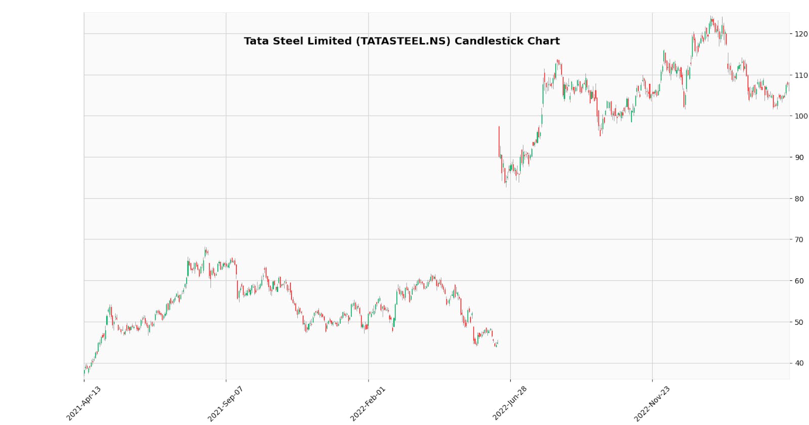
But this will give you an ugly chart that looks like this.

But you can change it to

You need to check the documentation for the specific styles but for this specifically, you can do it like this.
kwargs = dict(tight_layout=True, figscale=0.5)
for s in ['yahoo']:
    mpf.plot(data, **kwargs, style=s, type='candle', title=title)
plt.show()
At last I want to advise you to read the documentation for further styling.
